


Colours Of The Month – Summer Shades
By Ana Zuravliova
Regular readers of our blog will know we regularly explore a colour of the month, but with summer in full swing, we thought we’d showcase not one but five colours of the month! These vibrant shades are perfect tones for summer. With trend forecasters predicting a sharp rise in vibrant colours in the coming years, we thought we’d get ahead of the trends and show you which colours will make your home a bastion of fashion for years to come.

Peach Fuzz
This year’s Pantone Colour of the Year, Peach Fuzz is a striking colour for use at home. Described as “radiant with warmth and modern elegance”, Peach Fuzz offers a multitude of benefits that enhance the ambiance and aesthetic of a room. This refreshing, bold hue exudes a sense of comfort and cosiness, making it ideal for creating inviting and intimate environments. In general, peach tones can make a room feel brighter and more spacious, as their subtle vibrancy reflects light effectively. The colour’s versatility allows it to blend seamlessly with various design styles, from modern and minimalist to rustic and traditional.
Additionally, peach can be paired with a wide range of colours, including neutrals, pastels, and even bolder shades, providing ample opportunities for creative expression. This hue also has a psychological benefit, as its warm undertones can evoke feelings of happiness and relaxation, contributing to an overall sense of well-being in the home. As a warmer colour, peach works best in a window furnishing with soft shapes, for instance curtains. Peach cushions are also a sublime addition to a living room or bedroom.
Jelly Mint
The emerging trend of jelly mint interior design, as identified by esteemed forecasters WGSN and Coloro, is a refreshing and vibrant approach that infuses spaces with a sense of joy and playfulness. Characterised by the dynamic, translucent hues of mint green with a jellied and juicy quality to it, this trend will add a youthful, energetic finish to any space.
Jelly mint interiors embody a cute quality with sleek, minimalist furniture juxtaposed against retro accents. When put into practice, jelly mint is complemented by whites and natural wood tones, creating a serene atmosphere that is both inviting and rejuvenating. This trend also benefits from the use of light, airy fabrics, and materials, enhancing the overall feeling of freshness and tranquillity within a space. As a result, look to linen curtains and chic roller blinds to let this colour truly shine.


Transformative Teal
Casting their eyes even further to the future, WGSN and Coloro are also predicting a sharp rise in all things teal! Transformative teal, the 2026 colour of the year, introduces a sense of natural tranquillity and sophistication, merging the calming qualities of blue with the invigorating energy of green. This versatile hue works beautifully across various design styles, especially those with a more retro edge, adding depth and richness to interiors. Teal can be employed as a statement colour on walls, creating a serene backdrop that complements both dark and light furnishings. When used in accents such as cushions, throws, or artwork, teal provides pops of colour that invigorate the space without overwhelming it.
Its flexibility also allows you to pair teal harmoniously with a wide range of colours, including neutrals like white and grey, metallics like gold and brass, and even other bold colours like coral or mustard yellow. The impact of teal on the mind includes promoting relaxation and focus, making it an excellent choice for bedrooms, living rooms, and home offices, where a balance of calmness and creativity is desired.
Electric Fuschia
Following the explosion of pinks in the worlds of fashion and interior design, bold, fun shades of fuchsia bring a bold and dynamic, noughties club kid aesthetic to any space, making a striking statement that captivates attention. This vivid, purplish-pink hue builds on the Barbiecore trend and takes it further to exude a sense of confidence and creativity, perfect for those looking to inject personality and vibrancy into their interiors.
Owing to its brightness and energy, fuchsia can be used as an accent colour to create focal points, whether through cushions, blinds, or lamp shades, or as a dominant colour for a dramatic effect, in a colour drenched wall. Its intensity contrasts beautifully with neutral tones like white, grey, or beige, balancing its brightness and creating a sophisticated contrast. Additionally, fuchsia harmonises well with other bold colours like teal, emerald green, and gold, allowing for a rich and eclectic palette. The psychological impact of fuchsia includes stimulating energy and encouraging a lively, upbeat atmosphere, making it an excellent choice for social spaces like living rooms, dining areas, or studios.

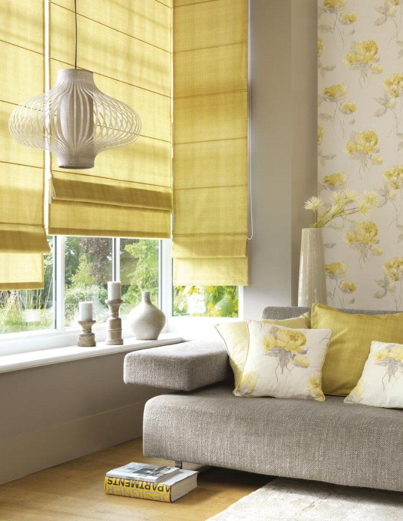
Butter yellows
Last, but not least, soft yet eye-catching shades of butter yellow radiate warmth, optimism, and a sense of luxury, making it a compelling choice for enhancing the atmosphere of a home. This enriching hue can brighten up spaces, creating an inviting and cheerful environment that lifts spirits and energises occupants, but it can equally provide a smart backdrop for more electric colours.
Butter yellow is particularly effective in rooms that receive less natural light, as it softly reflects the glow of the summer sun, adding a cosy and vibrant feel. Its gentle elegance allows it to blend seamlessly with various styles, from modern and minimalist to classic and bohemian. When used as an accent colour, through elements like cushions, curtains, or blinds, golden yellow adds a touch of elegance and sophistication.
Moreover, it pairs perfectly with both warm and cool neutrals, as well as complementary colours like mid tone blues and greens, creating dynamic and balanced compositions. Additionally, butter shades of yellow can evoke feelings of happiness and creativity, making it an excellent choice for spaces where warmth and inspiration are desired, such as kitchens, living rooms, and home offices.
The future certainly seems to be bright and bold! With these dynamic and diverse shades, you’ll be able to make your home the most fashionable property on your street, keeping it the talk of the town for years. Remember, if you need help finding the ideal summer colour for your interiors, you can order up to eight free samples from the website!
Shop some of our products inspired by summer hues:


