A Social Snapshot: Octobers Opulent Selection
Just like that, October has come to an end, so the time has come once again to show you our favourite posts from the past month! Fuelled by pumpkin spiced lattes, we have managed to narrow down our top pics from October to these final 4. To be filled with autumnal inspiration, and get an insight into different design styles, read on…
Our favourite posts from October
October is the month of halloween and the clocks change. It is really in October that we prepare ourselves for winter, and to help inspire you we’ve collated our favourite posts from social media this month.
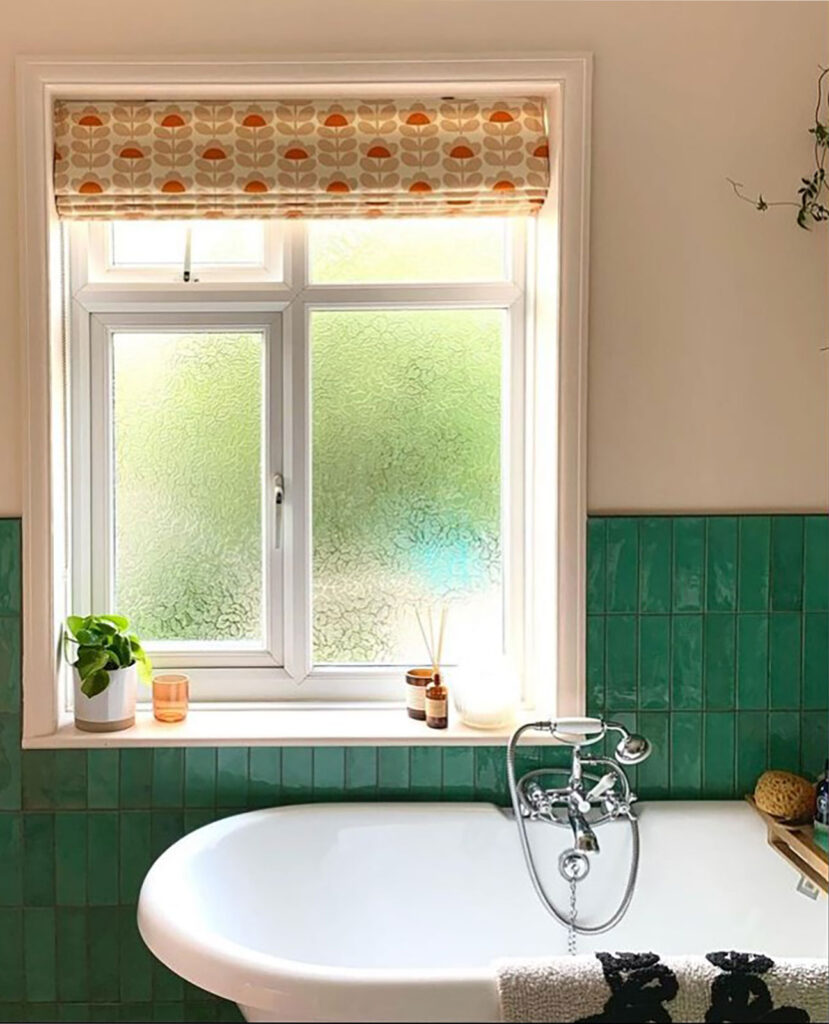
A stylish, quaint bathroom
With self-care spaces becoming an increasingly popular trend, bathrooms are one of the best spaces for unwinding and relaxing after a long day. Sinking down into a roll top bath, submerged in bubbles with the gentle flicker of candlelight definitely sounds like a small piece of heaven to us, and @smiths_at_home_ has designed a bathroom we would happily spend our evenings in.
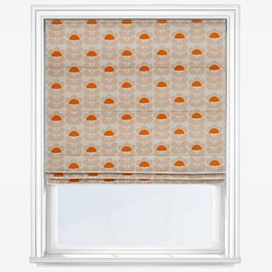
While sticking to a classic colour scheme of pink and green, @smiths_at_home_ has added a quirky touch to the space, making it their own with the Orla Kiely Sweet Pea Orange Roman Blind. The implementation of the floral print brings in a fun aesthetic to the space, while the soft colours complement the already existing pink and green colour scheme. Working with contrasting colours, finishes and patters is ideal for creating a truly unique space, as they allow you to find out what your design style truly is.
We hope you feel as inspired to play around with different prints, colours, and textures as we do, thanks to the eye-catching bathroom of @smiths_at_home_.
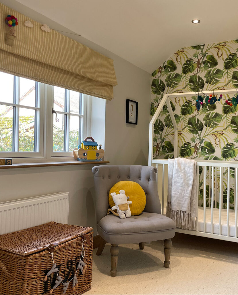
A playful nursery
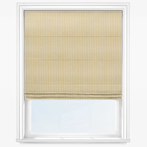
Nurseries should be full of inspiration to encourage the creative minds of babies and young children, and @thecopperbeechhouse’s nursery does exactly that. Just look at how captivating the space is, from the bold jungle leaf print wallpaper, to the striped Roman blind – it’s 10/10 from us.
When decorating a nursery, we believe you need good use of bold yet calming colours, and various textures, to achieve an exciting space for children to grow in. Going for bold colours such as yellows and greens will create a space full of energy, while the muted tones prevent the overstimulation of a child’s young mind. Not only do these tones bring visual energy to the space, but yellow increases confidence and creativity, while green helps to reconnect us with nature which can calm us down. These colours are the perfect choice for nurseries and young kids’ bedrooms.
With textures introduced via the wicker basket and wooden frame of the cot, this space has definitely ticked a lot of our boxes!
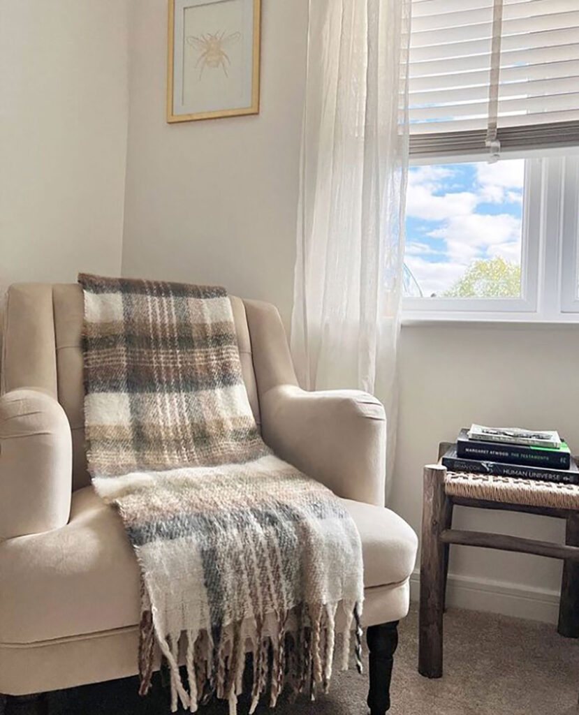
The perfect cosy corner
Elegant and chic is the perfect way to describe this cosy corner created by @humble._abode. The neutral colour palette accessorised with varying textures make for a calming yet captivating look and it is certainly a space in which we would want to nestle down and bury our nose in a good book.
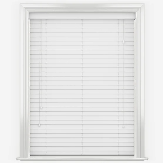
A classic window styling technique which @humble._abode has adopted is layering, where a window is furnished with both a blind and curtain. The combination of voile curtains and a white venetian blind creates a fresh feeling within the space, making it an ideal styling aspect for any room within the home.
We particularly love the addition of the tartan throw and wicker side table, as they help create a cosy aesthetic and bring depth to the space. Tartan and checks are often a print that people tend to be hesitant to use, but how the @humble._abode has implemented the tartan throw into the space has filled us with inspiration and we are now planning on how we can tartan up our spaces!
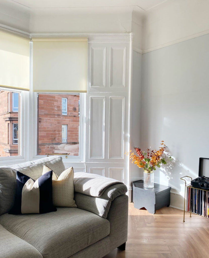
A minimal charm living room
There is something very aesthetically pleasing about a minimalist interior. Whether it’s the uncluttered surfaces, or neutral colour palette with a dusting of darker furnishings, this style is certainly captivating.
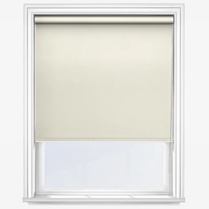
@lorisarah_home has created a truly beautiful, minimal design living room with a complimenting colour palette and enriching textures. When it comes to dressing windows for a minimalistic look, finding the right style can be challenging. Roller blinds are our recommended go to for a minimalistic design, thanks to their compact look, and as we can see from @lorisarah_home’s living room, they work wonders in a minimal look. Combined with arming natural tones, the choice of furnishing style, fabric and colour combine to make a space that is minimalist without being cold.
If you would like to learn more about minimalistic interiors read our Minimalistic Design blog for all the top tips on how to achieve this trending design style, or head over to @lorisarah_homes page for more inspiration!
As always, we love to see your wonderful interior creations, whether they’re quirky looks, minimal designs, or something completely different! Be sure to tag us in your posts on Instagram by using our handle @blindsdirectgb for a chance to be featured in our November social snapshot blog! We look forward to next month’s social scroll.
Shop some of our favourite products featured in, and inspired by these posts:
