A Trip Down Memory Lane – Top Tips From The 20th Century
For centuries, people around the world have sought design inspiration from the past. The Romans looked to the Classical Greeks, those during the renaissance looked back to Rome and the skinny jeans and brimmed hats of the early 2000s were clearly inspired by the 1960s. Today, our inspiration is broader with many of us borrowing from different decades to decorate our homes. In today’s blog we’ll be taking a stroll along the 20th century timeline to see which elements of decades gone by can be used to improve the style of our home today.
The dawn of the 20th century
As the Victorian era began to give way to a new century, change was already in the air. The early years of the century saw the pinnacle of the celebrated arts and crafts movement and the continuation and evolution of the still popular Belle Époque, which we will look at closer in the 1910s.
The arts and crafts movement is all about handmade items. Today, arts and crafts still stands for traditional craftsmanship, often using medieval, romantic, or folk decoration styles.
To make the most of this mini rebellion against industrialisation – which can be likened to today’s globalisation and mass production – look to celebrate the bounty of nature using natural materials and colours. With the movement’s aesthetic also featuring many straight lines and right angles, nothing could be better than a beautiful natural wooden blind set against a large window. Couple this blind with dark leather furniture and an open space, free of clutter.
10/10 for 1910
Before the disastrous events of 1914, life in Europe had moved back to more luxurious design. As exemplified by La Belle Époque that ran from the 1880s until the war, this life celebrated a long-lasting peace and the dramatic explosion of art and culture.
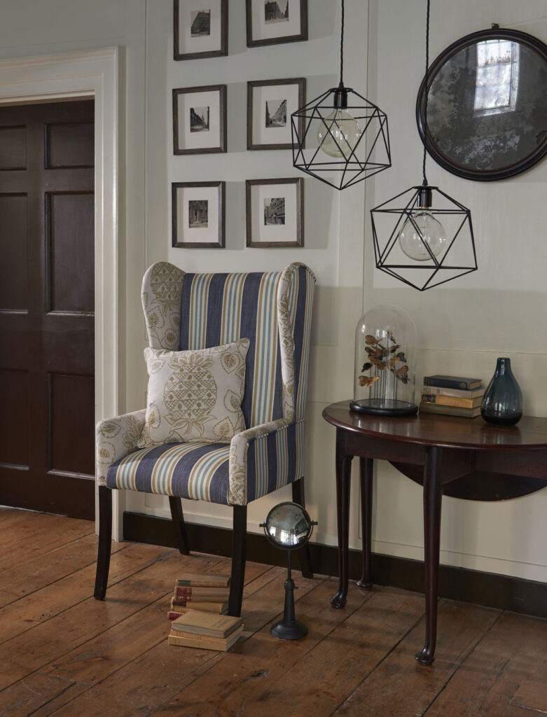
To theme your space around the 1910s, consider how light reacts with items in your home. Large mirrors are a great addition as too are beautiful lamps coupled with a striking patterned lampshade.
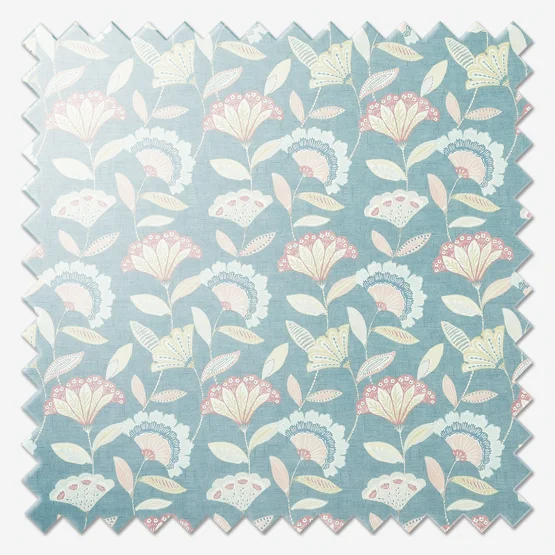
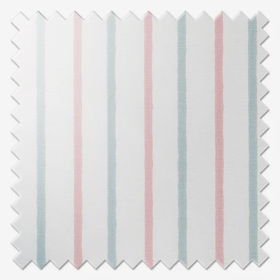
Also consider greater use of colour than the noughties. Ocean and duck egg blues coupled with off whites were very popular and are becoming so again. These colours can be enhanced by including salmon pink details so look to cushions and lamp shades for the best effects. Be sure to investigate the colours of the Art Nouveau era, especially purple, peacock and emerald green!
The jazzy 1920s
The era of prohibition, sharp suits, cloche hats and the Great Gatsby, the post war 1920s was a decade of elegance, sophistication but most importantly – fun!
Fun is a key characteristic of the 20s, as is daring and bravery. After the chaos of the war, people felt less constrained by conservative norms and more able to express themselves – its one of the largest, quickest shifts in design in history.
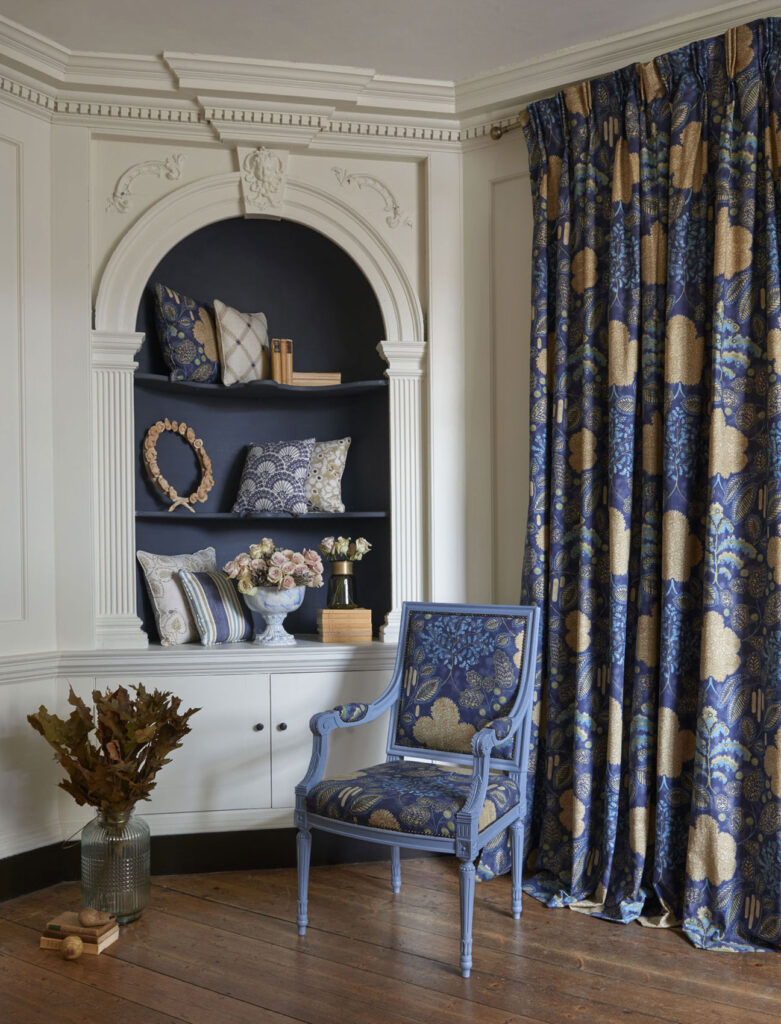
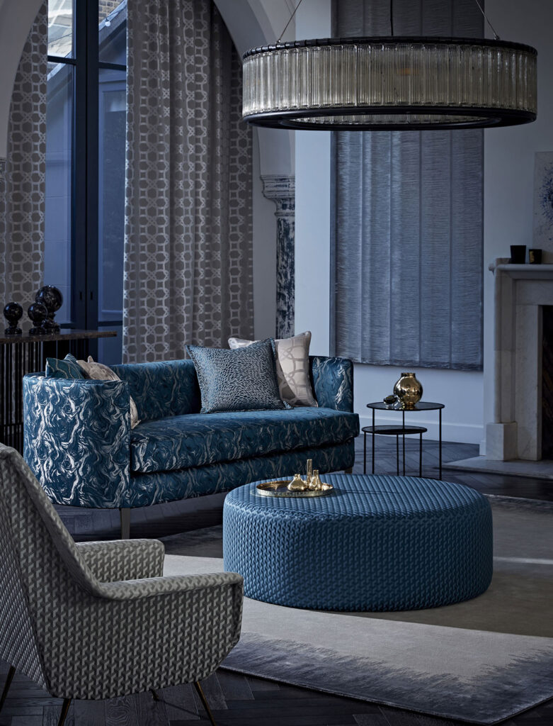
While you may jump to black and white to match the photos – don’t feel like you have to – the 20s was actually a decade of great colour deployment including teal and emerald, navy blue and crimson. To learn all about the colours, patterns and importantly materials available to you, be sure to read our 20s Glam blog!
Giving art deco a go
Events of the 1930s led humanity down a very dark path however its important to remember that this decade was also influential in interior design and it’s becoming popular once again.
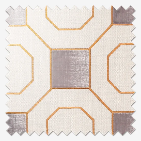
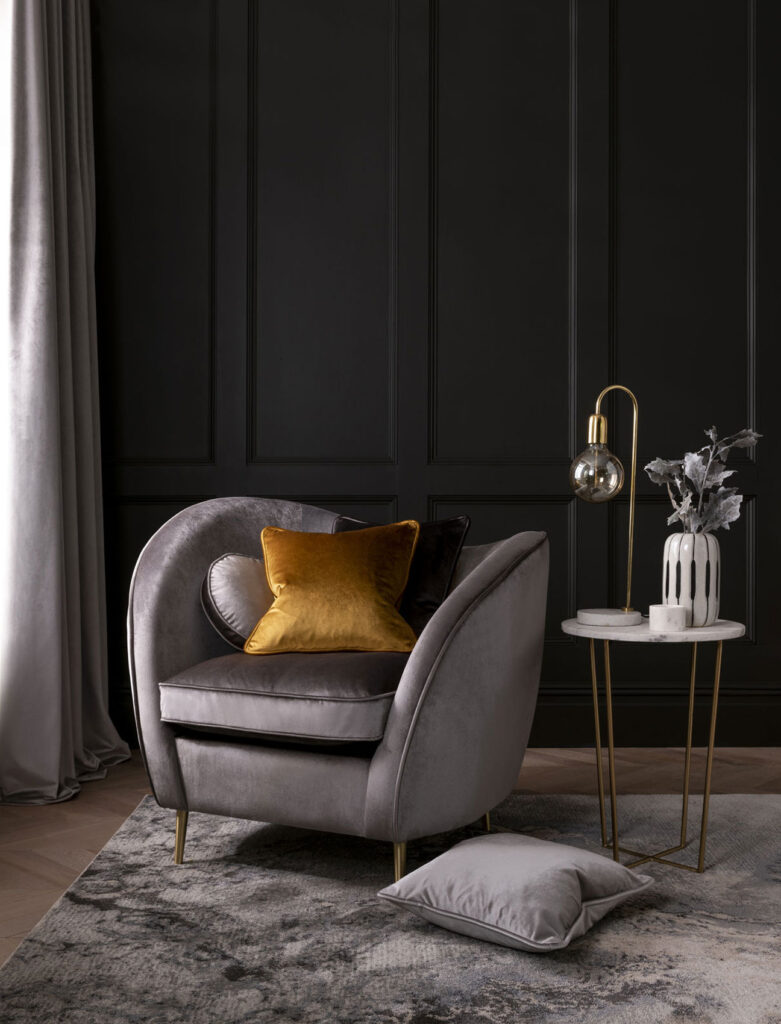
For many years now, the interest in vintage design has grown and grown and people are increasingly looking to the 30s for inspiration. For some time, the 30s was synonymous with black laquer, gold and luxurious materials. These combinations still offer a great range of options for the discerning decorator especially when black is replaced by dark slate greys and the gold is left just as it is.
This archetypal 30s style can still be as beautiful today as it was 90 years ago, but there is more to this decade than our collective memory often conjures up. You can use myriad colours to really fit the 30s. Top contenders are mint green, oranges and zesty yellows. Cushions hold these colours very well but you can also use them in a nice, soft curtain too!
Over to the 1940s
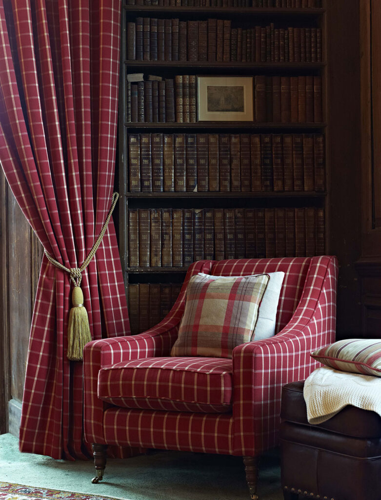
With half this decade dominated by the misery of the Second World War, its amazing that such great interior design trends were born in this ten-year epoch. Where the 30s saw great use of juicy, lighter tones; the 40s is all about rich colours. Deep dusky pinks, terracotta and red tones are extremely relevant here.
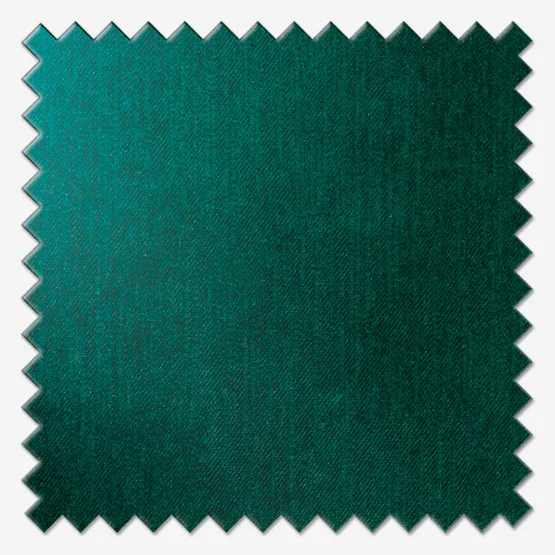
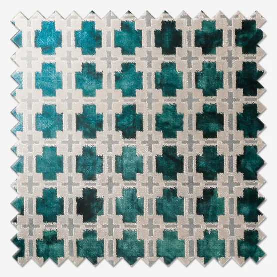
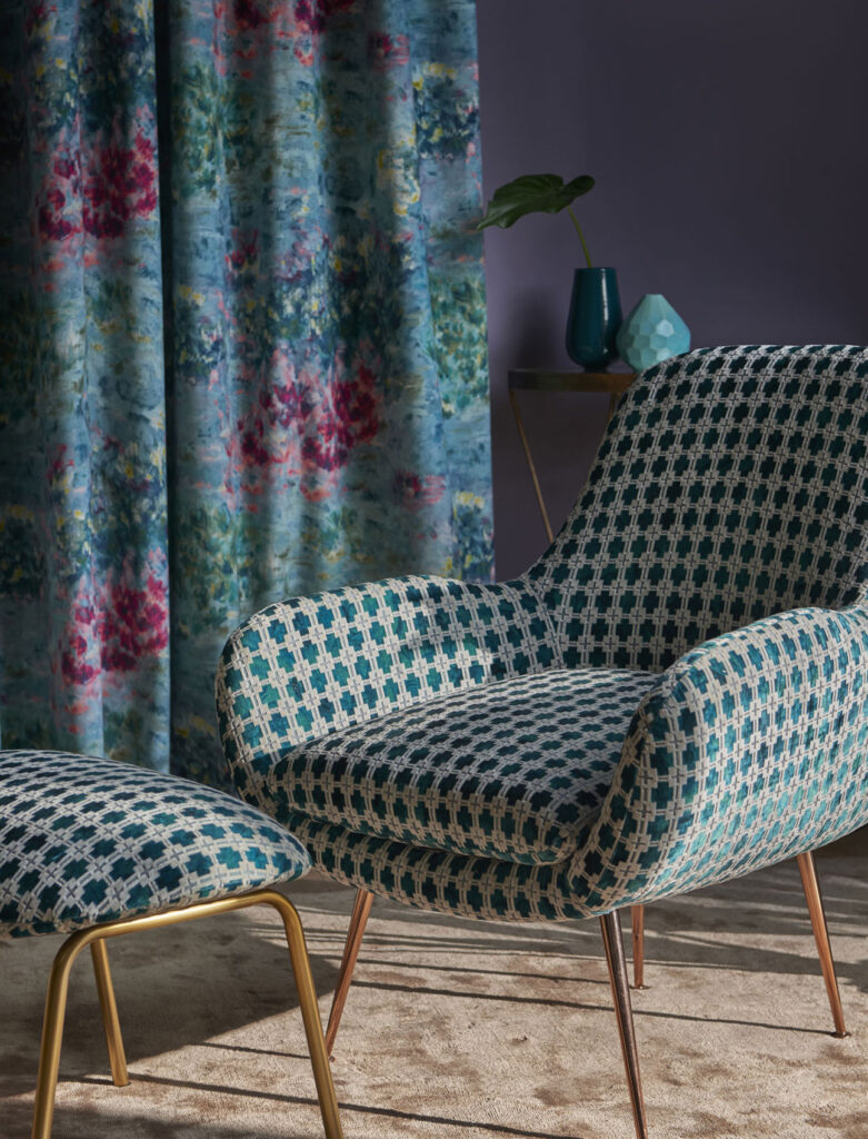
Supporting colours to muse over are definitely teals and emerald greens and nothing holds these colours as well as velvet. Look to curtains or for a more modern twist, Roman blinds alongside cushions.
An additional point to add is avoid suites of furniture. If every item brings something different to a room it will enhance the beauty and create a unique space. What’s more, large rectangular mirrors are fantastic additions to a 40s-inspired space.
50 years in
Halfway through the century, and after two world wars, the 1950s was a decade where people again evolved their interior design. Out of the greyness of war and misery came colour – lots of colour!
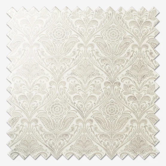
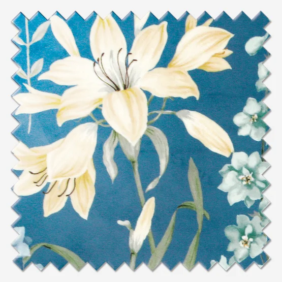
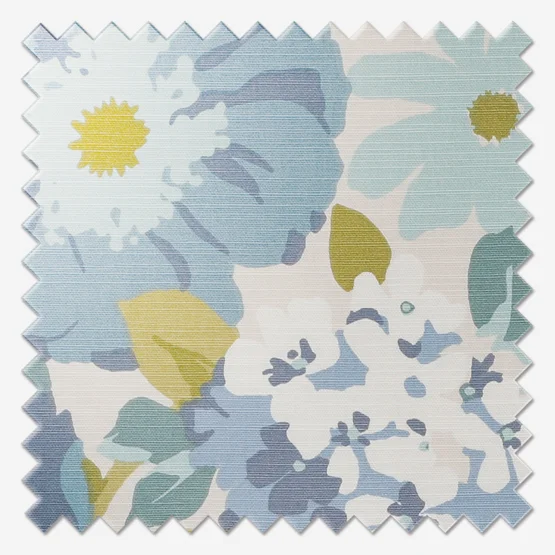
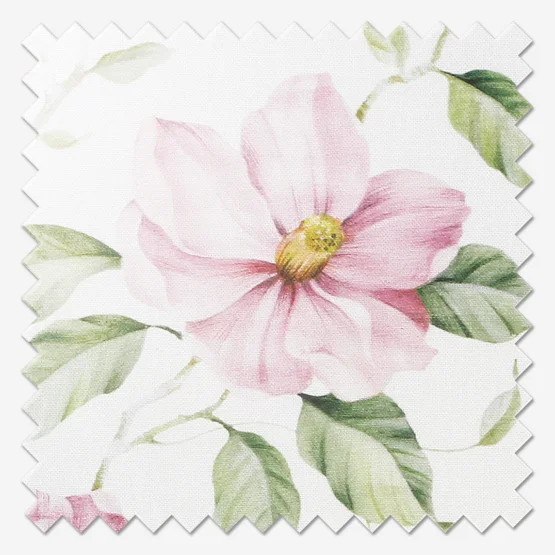
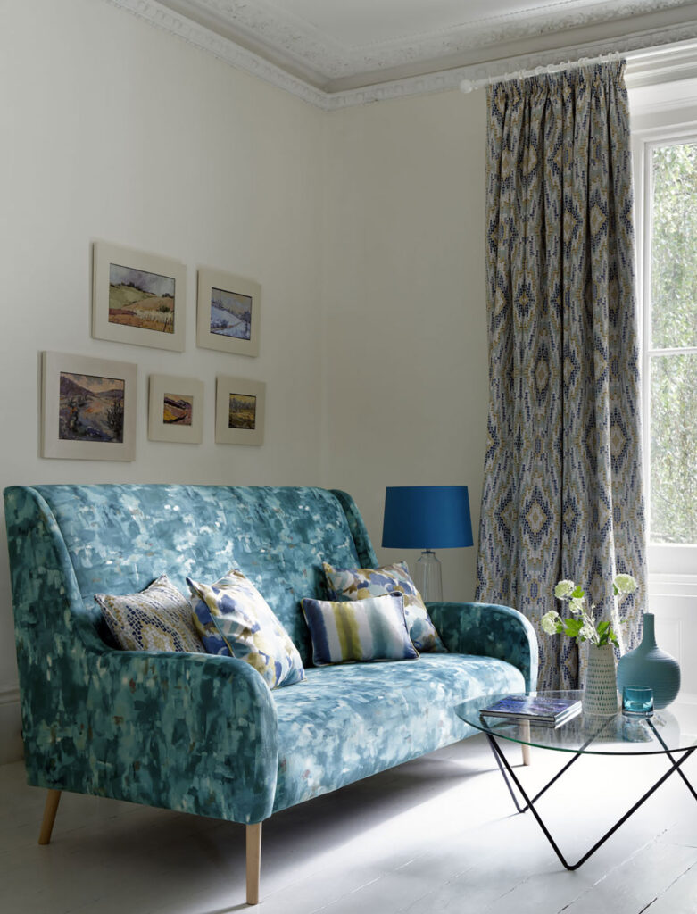
Pastel tones were a driving theme of the decade with bright, artificial colours adding amazing spots of differentiation. Floral and damask prints were extremely popular as wallpapers but could be equally well used today in lamp shades or especially floral roller blinds which mirror the sleek, flat nature of the wall, unlike a curtain for example.
Interestingly enough, it was in the 1950s that the then known “Scandinavian colours” trend became popular with its earth tones of browns and greys. For more information read Scandi Design Interiors and Style.
Designs of the swinging sixties
15 years after the end of WW2 people started to rebel against the darker half of the 20th century and a revolution of morality, colour and sensibility was driven by the post war youth. This was the era of the summer of love, yellow submarines, and Mr. Wilson’s ‘white heat of technology’.
Ever since it happened, there hasn’t really been a time where the designs of the 60s hasn’t been seen as stylish, unlike much of its jargon. Groovy no longer indeed.
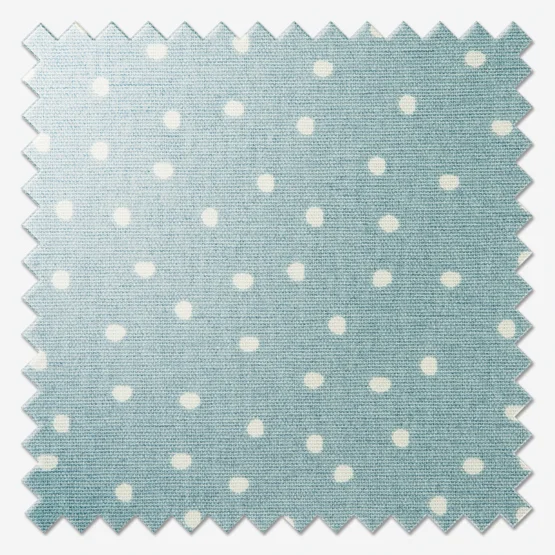
In many ways, the 1960s is a decade of radicalism, and challenging convention. Psychedelic bright colours, a mixing of materials and busy patterns are all at home in a 60s-inspired home. Dots, stripes and geometric patterns in a pop art palette pair with all-white sitting areas will create a mixture of Andy Warhol and Mad Men all in one.
I think the main thought here should be to break rules. Don’t be too worried about whether something is exactly right, like the whole decade, this should be about free expression. Remember, John Lennon even had a psychedelic Rolls-Royce, the rules are meant to be broken!
Carry on 70s
Roller skates, bean bags, flares and disco – it’s 70s interior design!
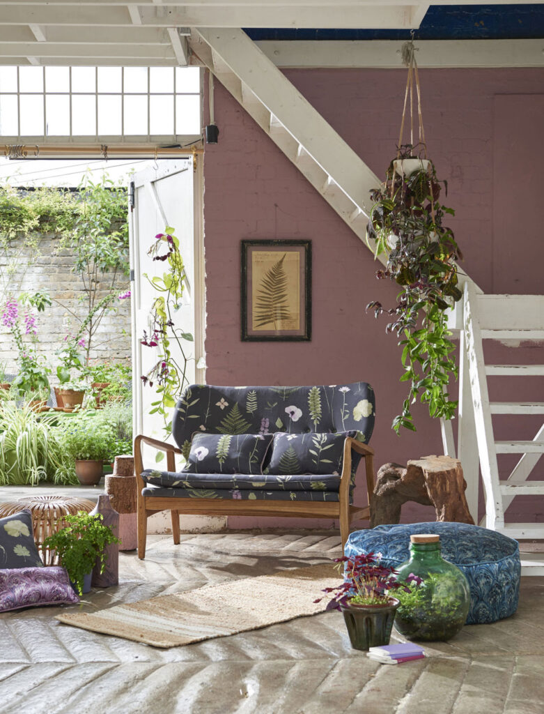
Wooden panelling, hanging chairs and boxy cabinets were a big hit during the 70s but unless you’re wanting a picture perfect 70s space, you can introduce a nod to this with a pale wooden Venetian blind. Where the 60s features a lot of dots and stripes, 70s patterns were also often angular so feel free to try bolder patterns at your leisure.
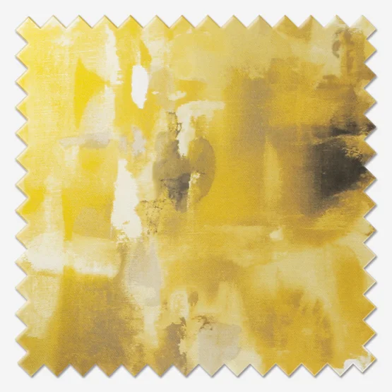
Chocolate brown was a famously popular colour during these ten years but so too were hunter green, mustard yellow and dusty rose. Don’t be afraid to cause a clash of colour or pattern, if you want a Terrazzo print lampshade in front of a funky patterned curtain, all power to you!
How soon is now?
If all you want to do is avoid the world’s gremlins with a cocktail in hand then the shining option for your décor is 80s style.
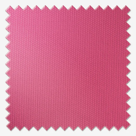
The colour purple, especially in a deep dark colour is very fitting for the 80s and smaller items including cushions and lampshade can look very pretty in pink. Traditionally, the bright, juicy neon tones of the 80s could be seen as a risky business, but when done right, they defy the ages and become great additions to modern homes.
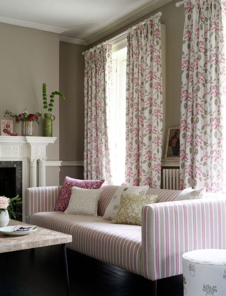
The 1980s’ obsession with chintz also allows you to play footloose and fancy free with design and colour, especially if you’re looking to harness country style or a more preppy vibe. The popularity of shabby chic can also save you from your home looking a little too yuppie.
The end of an era
The 90s was very much Brit pop meets Tuscan-style. Blow-up furniture may (hopefully), never come back into fashion but much of this decade has with many children of the 90s turning 30 and decorating their own homes.
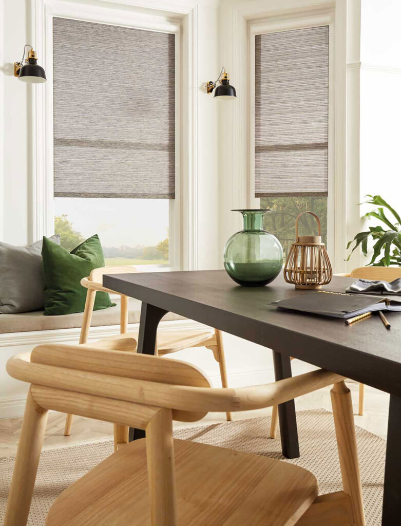
Blonde wood is back, as is Wicker and Rattan. Furthermore, so too are fringes and brown too. Brown has been a bit of an unsung hero of the decade but when coupled with a natural colour-inspired space, it can add a really classy statement to quite a muted space. If you really, really want to add a touch of zigazig ah, metallics and neon colours remain your friend, especially when they appear or a striking velvet curtain or blind.
Did you spot all the references to movies from the 80s? If so, enter our competition by clicking the button below!
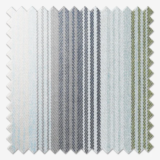
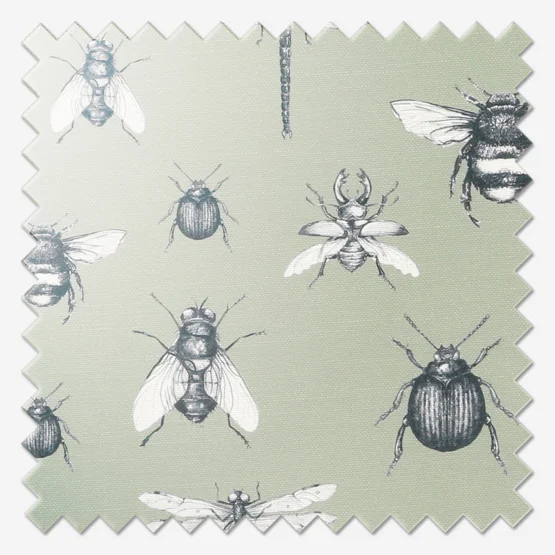
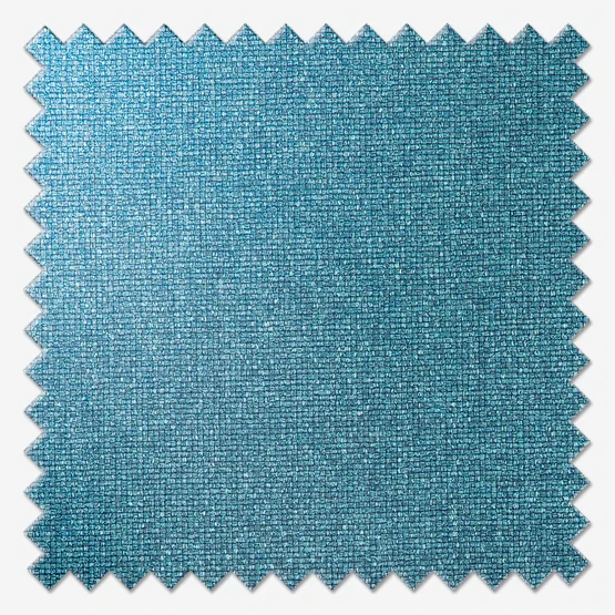
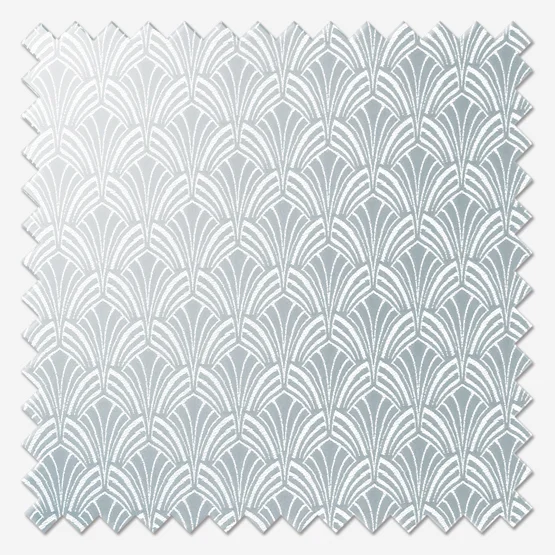
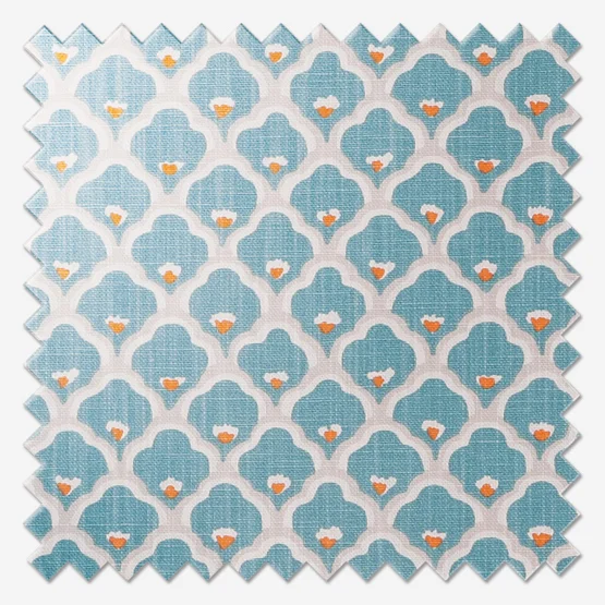
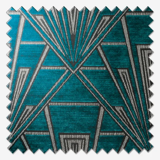
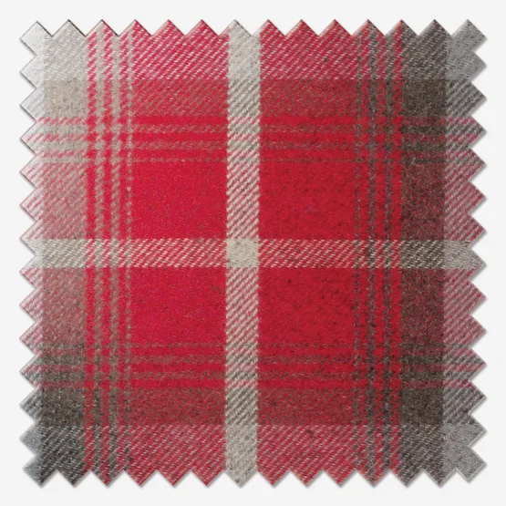
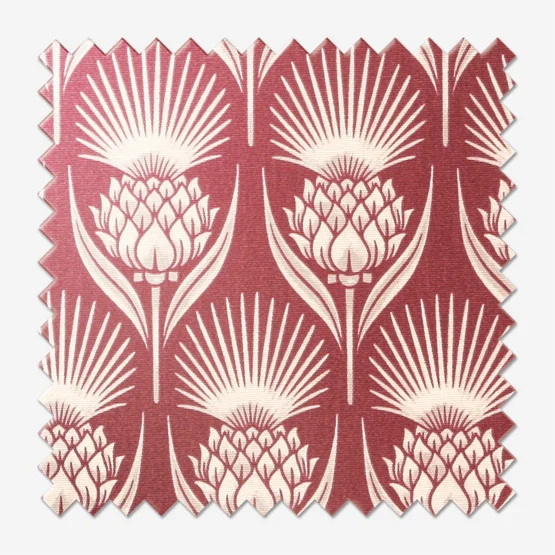
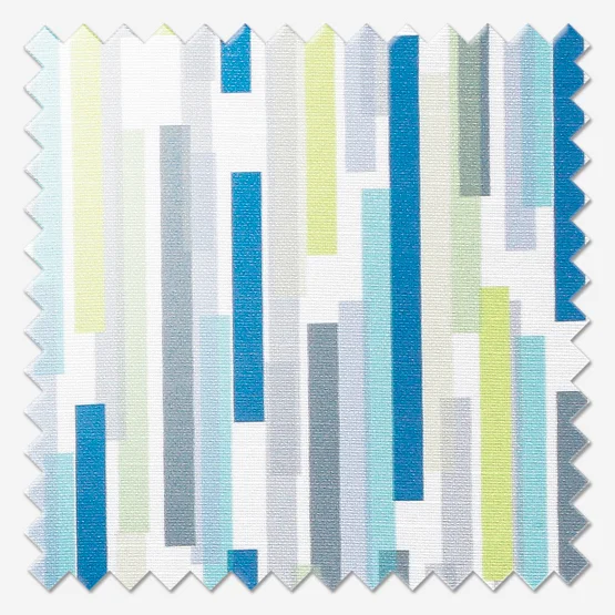
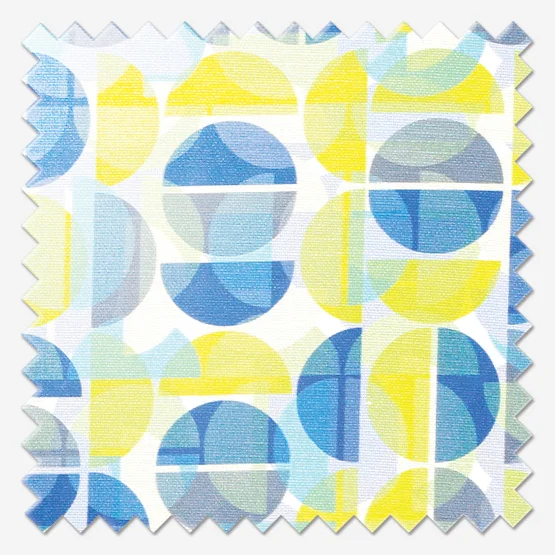
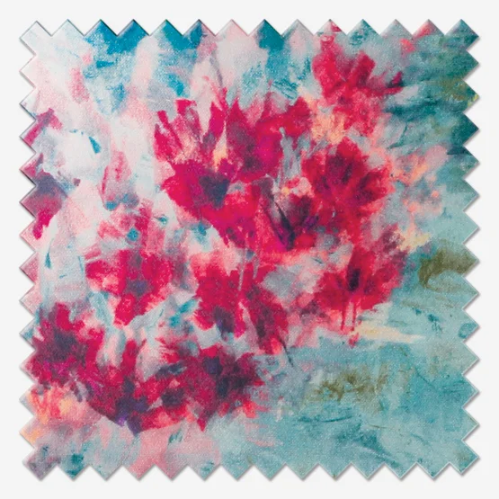
All correct answers will receive a 10% discount code for their next order, and one lucky winner will win a matching cushion and lampshade in one of the fabrics featured above.


