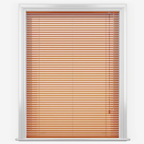
Colour Of The Month: Obsessed With Orange
We’re quickly coming to the time of year where there’s leaves on the ground, pumpkins everywhere and children dressed up as tigers and what do all of these have in common? That’s right, different shades of orange! Orange is a colour synonymous with October, and the autumn, and while we’ll see much more of it over the coming weeks, this excellent colour is one you can enjoy in your interior design the year round. Read on to learn how…
The power of orange interiors
As colours go, orange has a profound effect on our psychologies. It reminds us of fun, playing, joy and youth. Moreover, orange is a very comforting and warming colour, used well in the home, it can make a space feel very cosy and welcoming which is exactly what most of us are looking for!
Like all colours, there are varying shades of orange, some of which are lighter and more energising than others. One of the most important factors to consider when using orange in interior design is the intensity of the tone and how much you use of it. As with other colours – including greens, reds, and blues – the darker tones which are closer to the neutral side of the spectrum can be used more freely than the brighter, more saturated tones. Afterall, we don’t want your space to feel like it’s been tangoed!
Using different shades of orange
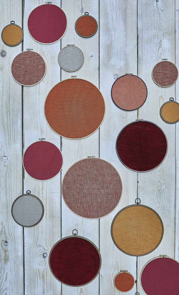
As we’ve said, different shades of orange require most contemplation than most other colours, but it’s certainly worth the time. Let’s start with lighter oranges.
Vivid shades of orange
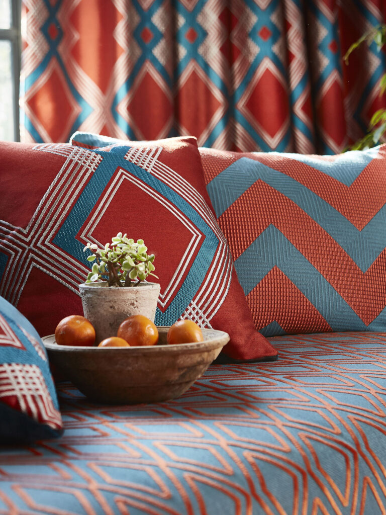
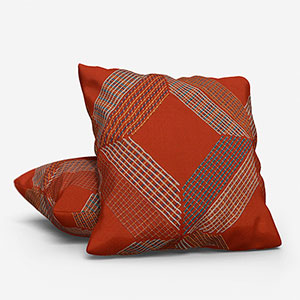
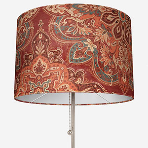
Vivid shades of orange – such as amber, tangerine and pumpkin – are amazing spot colours. Used throughout the home in smaller items such as lamp shades or cushions can make a space come alive without being overpowering.
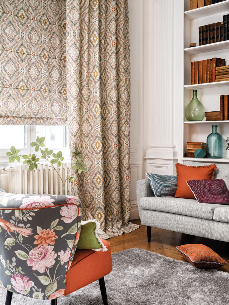
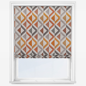
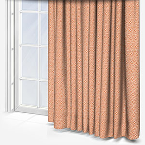
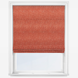
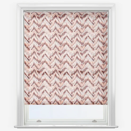
Additionally, you can find some amazingly patterned Roman blinds, roller blinds or curtains that make refined use of orange. These will work equally as effectively as cushions and lampshades. The rule of thumb to remember is essentially, the more vibrant the shade of orange, the more sparingly you should use it.
Burnt orange colours
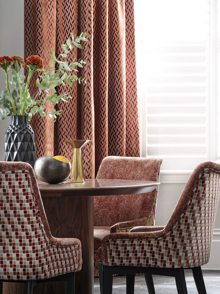
Burnt orange colours and brownish orange colours give you a lot more flexibility within interior design. Because these tones are more muted and less statement colours, you can use these happily in larger pieces in the home.
Some of the best examples of this are found in curtains and Roman blinds. The weightiness of these window furnishings, especially when combined with orange, will make a room inviting and comforting. You can also add thermal linings to these furnishings to help improve the temperature and snug feeling of the space.
Finally, think about the space you’re looking to update and the purpose it serves in your life. As orange will enhance the energy of a space, use it where you entertain, work, or want to improve stimulation or motivation.
Which colours go well with orange?
Unlike blues and whites, no space is going to be just orange, so which colours are the best bedfellows for today’s subject?
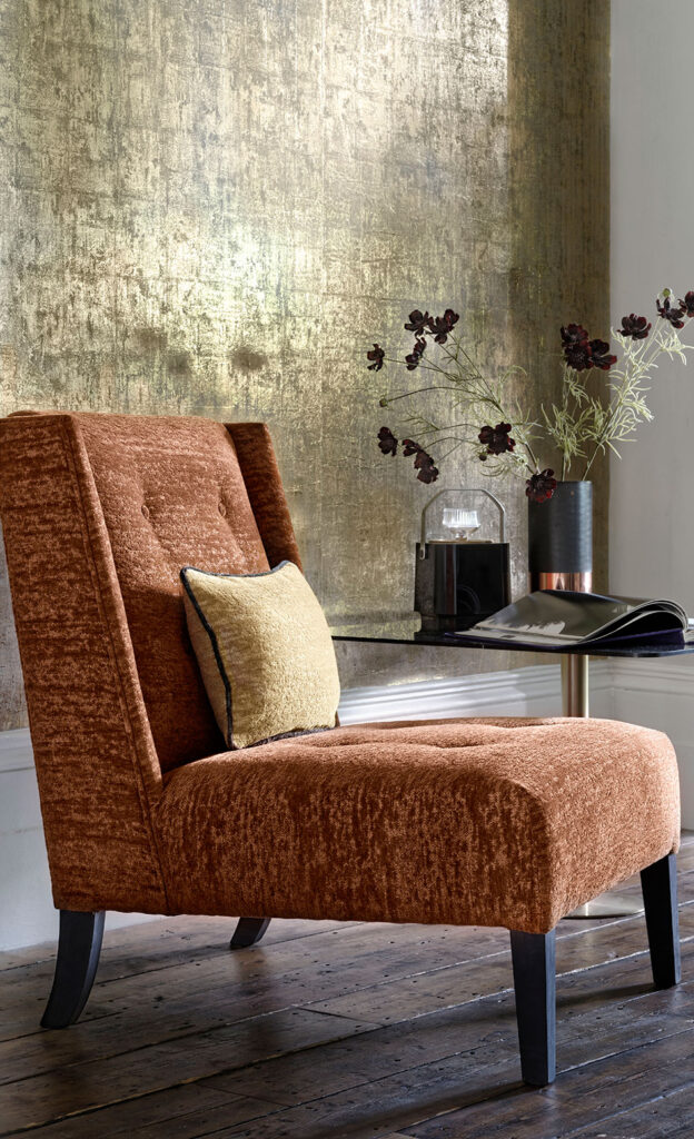
Classical designs in shades of brown will profit from being used with orange, but so too will navy blues and slightly off whites. When the leading colour is pale, use warmer shades of orange but if it’s a darker shade, a contrasting – but limited – use of more bright orange will add a depth and character to the space.
Our favourite orange colour combinations
Contemporary, fashionable spaces will benefit from fresher, more youthful and dynamic colours. Turquoise, eucalyptus, and powdery light blues, when combined with an appropriate shade of orange, will certainly be on trend with a hint of sixties retro to it. Three of our favourite combinations are:
Orange and navy blue
Orange and navy is a fantastic combination to use in interior design! The calming nature of navy contrasting with the fiery energy of orange is one that is sure to delight. To make the most of partnering orange and navy blue, look to mid-shades of orange and if in doubt, use a shade that’s opposite your blue tone of the colour chart.
Orange and white
Few colour combinations using orange are as chic as orange and white. Orange and white have the ability to create two striking looks. The first is a modernist theme where you use contemporary, slimline furniture and sharp angles. Alternatively, burnt orange and white, especially if you use a slightly off white, can look very traditional with a twist of the mediterranean.
Orange and brown
Orange and brown can be easily used to make a funky take on a 70s inspired space. Not only that, orange and brown can help to make a stunning classical interior design. Introducing dark brown tones by using natural woods or dark leather, allows you to introduce orange tones with curtains, blinds or cushions to create an extremely beautiful space.
If you’re not 100% sure which tone of orange will suit your current décor, you can order up to eight free samples to see them in the flesh!
Exploring our range of orange products couldn’t be simpler. Once you’ve decided on the style of window furnishing, cushion or lamp shade, you can use the filter options on the page to find all the different shades of orange we have. Moreover, it will even show you some of the amazing patterns which feature orange alongside other exciting colours.


